I play a mobile game called Lords Mobile. The game is from IGG, a mobile game company which is quite big. They initially started with PC games but later shifted to mobile games. I remember playing a game from them 10 years ago, Texas Hold'em Poker. Later I started playing this lords mobile probably in 2017-18. Good long days.
As I was playing the game a few days ago, I suddenly came across it in the news section. It was about a LOGO contest. Man, it started on 20th May. Why did I not see it before? The deadline was shown on 16th June Midnight, which means 17th June 00:00. I suppose it was in the Chinese time zone, but then the time was written as GMT -5. Either way, I had approx 2 days to complete all the logos.
There were two Themes. A, innovation. Keep the Original logo intact and change the slogan from "I got games" to "Gamers at Heart". The fonts colours and placement were a free choice, however, it had to be vector outlined and follow the 3 format rules. 1- in Colour format (for a black background and a white background), 2- in Black and White format (for both black and white background) and lastly 3- Flat format (for both Black and White background).
And Theme B was to create a whole new logo with the same slogan "Gamers at heart". With all the same rules and formats but the LOGO must have to be in Pixel art style. And I have never created a pixel art design before. I started watching Youtube to learn how to create so by Illustrator.
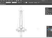
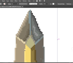
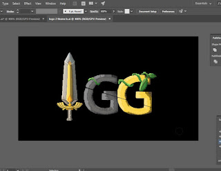
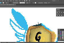
This template was given to follow. One could give 5 entries for each theme. And I was planning to give as many I could within the time. That's the reason why these past two days were such hectic as I mentioned in my earlier blogs.I started with Theme B. Started drawing the rough outline and coloured them. Like:
So basically, a colour format. Then the colour format for both black background and white background. If there's a lighter part in a logo, I had to recolour it so it is visible on white background. And If there's dark/black part in a logo, I had to make it lighter or recolour to something else for it to be visible on black background. Then there were black and white versions. Which was super easy and fast to convert to. And if I picked Grey instead of white or black colour, it becomes visible in both white or black background. So black and white transformation barely took 5 mins.
The next was the flat format. While it should have been so easier if I kept duplicates of the layer when I drew just the outline or created the pixel and didn't expand yet. Because I didn't have the duplicated layer for some of the logos' outlines, I literally had to recolour the logos in ONE theme colour omitting the shades and lights I had done before.
This process took a lot of time. And the last one was being "colour code". While it was not a hard step for say, but very repetitive and time-consuming. Creating blocks of all the colours used and writing the colour codes beside them kind of made me cranky. It was almost 9pm which was the deadline. I also had to get back on my digital learning course with my friend Winnie. There were too many things going on with such a small time frame, I lost my temper and had it on my friend, which was not cool of me.
Thankfully I created all the pdfs and mailed them with proper title and formats to IGG. Oh, I forgot to say, I also had to create a description note for each logos I created. I will give you an example of the descriptions I wrote.
Anyhow, I will end the blog here with the files I sent to IGG. I will attach them here in case, someone would like to have a look. It's 19th of June now. I had taken 2 days of break from illustration. After such hectic work for the past few days, I eased on myself and let myself breathe. Although I wish I would come across the contest earlier so I would have more time to work on the logos and probably would do way better. But nonetheless, I am quite happy with the logos I had created. If it was not pixel art, the logos would shine so much more.


Comments
Post a Comment